
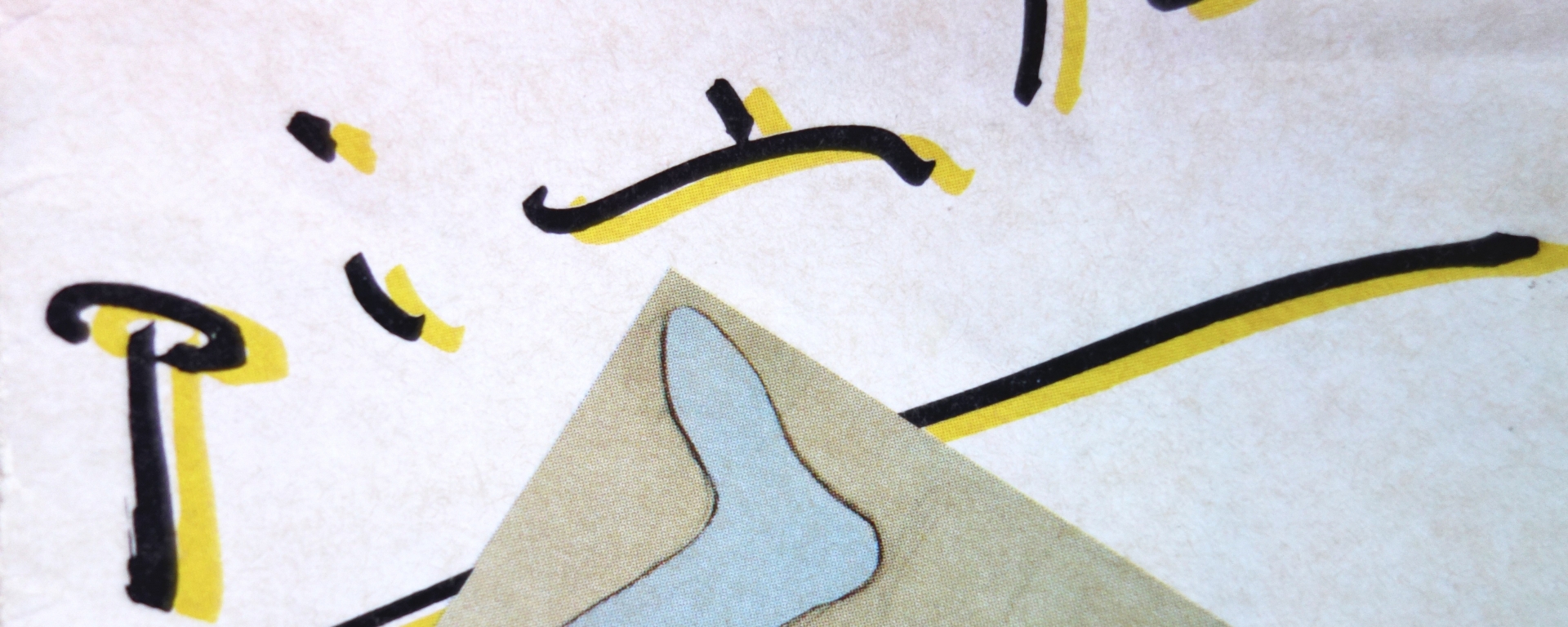
A while back I found this brochure for a Picasso exhibit at Le Musée des Beaux-Arts de Montréal. The exhibit was way back in 1985. What I found curious about it is the cover of the brochure, specifically the main title and dates of the exhibition. Opening up the brochure, you see the same type treatment in the titles. They play off Picasso’s signature, or at least try to emulate it.
I’ve always found Picasso’s signature as very playful in nature. Widely spaced, and all lowercase, if his signature wasn’t so familiar to us now, we would be commenting with “I don’t know who the artist is because his signature is illegible”.
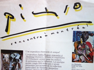
The titles within the brochure have similar characteristics: they’re widely spaced, or as we designers like to say, too much kerning; they’re all in lowercase letters and even the proper noun, “montréal”, is set in lowercase. It’s more than clear now the look the designer was going for when creating this brochure. Even though the brochure is more design than art, there is a nice blend of both. And this is what I enjoy when I look at graphic design like this. A fine line between art and design and vice versa. I know there are better examples online that I could have found. But the difference is that I have this brochure in my possession.


But some examples of commercial artists I can draw from the internet include A.M. Cassandre, Lucian Bernhard, Edward McKnight Kauffer, Henryk Tomaszewski et al. These commercial artists used traditional methods and media such as gouache, watercolors, acrylics, collage, screen printing, etc. Andy Warhol transformed the Campbell’s soup labels into works of art using screen printing. Historical note: The original designs of the Campbell’s soups was a co-operative effort, according to this NY Times blog post: Who Made That Campbell’s Soup Label? This is a great example of design becoming art. And what about art becoming design? Well, in that sense I’ve always found the legendary Milton Glaser’s work to be artful. One of his great pieces in particular is the poster and album cover art work for Bob Dylan. Is it any wonder that this piece is in the Museum of Modern Art (MoMA)?
So hopefully we’ll continue to use a little bit of our art into our designs, and a little bit of our designs in to our art. Of course a little bit is just a suggestion : )

One thought on “The Art of Design. The Design of Art.”